


The Theory of Colour

Story by
November 16, 2017
 Colour can have a significant impact on the atmosphere of a space and the wellbeing of building occupants. Here, Paul Fleming, Commercial Colour Services Manager at Dulux Trade discusses the latest trends and studies that can help specifiers to utilise commercial properties effectively.
The importance of colour cannot be underestimated – and should be used to its full potential. A well thought out colour palette and interior design can have a significant impact on the overall aesthetic and feel of a space, as well as the behaviours of building occupants.
Contrasting colours and zoning
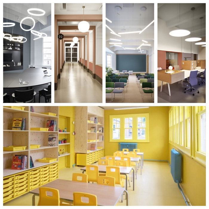
With the rise of open plan spaces, particularly in offices, selecting a colour scheme design that associates blocks of colour with the purpose of the room or signals a transition to a different area can be beneficial in terms of orientation. For instance, graphic borders that use colour contrast, such as framing pastel colours with a boarder of coal and dark blue, can help specifiers to create a sense of space as well as aid spatial awareness.
Colour contrast can also help specifiers and building owners adhere to the guidelines set out in the Equality Act Approved Document M (ADM). By creating clear distinguishing differences between walls, floors, doorframes and ceilings, spaces become easier to navigate, particularly for those with visual impairments; aiding in the identification of key building features and ultimately contributing to safety.
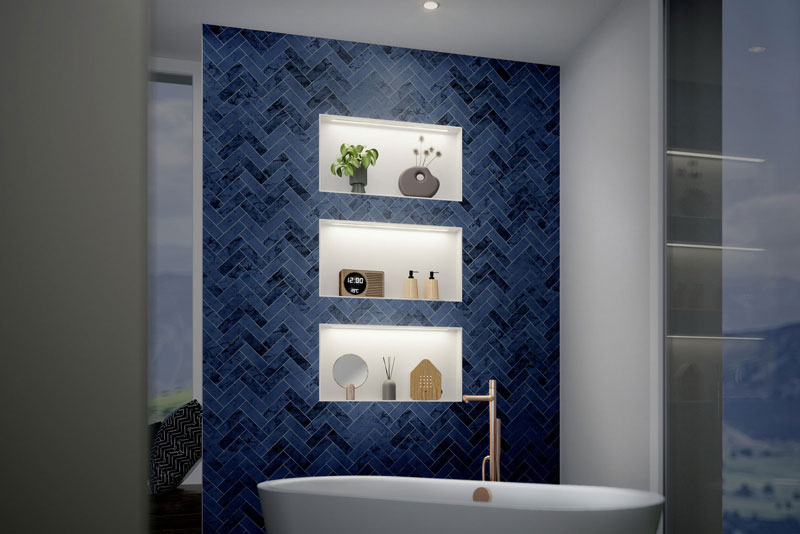
Introducing simple colour statements to the floor and walls can create zones and help segment a larger open space into more specific areas. Here, a cool colour palette, which encourages productivity, should be considered. For example, cool shades of blue encourage a clear-headed approach, while light neutrals and sea-greens support a need for connection – ideal for a working environment where employees are encouraged to collaborate.
However, in larger commercial developments a colour palette of key neutrals or one main colour as a base scheme is recommended. This will provide a cohesive flow throughout the building whilst reducing the amount of paint required for maintenance purposes.
Enhance design
Paint colours can also help to emphasise architectural details within a building. By using subtle trim lines along crown mouldings for example, specifiers can add a modern twist to a feature that might otherwise be overlooked. Colour accents can then be incorporated within the interior design of the room, such as within the floor design or ornamental finishes – this attention to detail can greatly enhance the perceived value of a space.
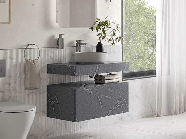
As seen towards the end of 2017, rich materials such as walnut, brass, marble and matt-black surfaces are increasingly becoming part of modern design. As such, paint schemes should be developed to complement these design details. Therefore specifiers should look to incorporate muted tones and smoky warm neutrals within colour palettes to provide the complementary background to modern design.
Bring the outside inside
When deciding on a colour scheme, specifiers should also consider how the scheme could contribute positively to the wellbeing of building occupants. With the World Health Organisation (WHO) expecting to see stress-related illness, such as mental health disorders and cardio-vascular disease, to be the two largest contributors to disease by 2020, it is important that urban spaces incorporate a sense of calm into the design brief.
Integrating direct or indirect elements of nature into the built environment – otherwise known as biophilic design – have been proven to reduce stress. For example, a study commissioned by Interface looking into the effects of biophilic design found that when employees work in an environment with natural elements, their wellbeing increases by 13%.
Therefore to create an environment that combines nature with the urban structure, natural colour schemes should be incorporated within the design – using calming tones of blue, herbal greens and warming yellows.
Ask the experts
With a multitude of colour palettes, combinations and factors to consider, specification can seem like a daunting task. However, leading manufacturers should provide thorough guidance through the use of expert colour consultants who can support the specification process and answer any questions that may arise.
For those looking to create interior schemes themselves, whether it is a simple concept board or a detailed colour and product specification, there is also a range of practical and easy to use online tools available.
Many of these tools are now easily accessible in an app format, allowing specifiers to download them to personal, mobile devices and review and amend colour palette options from wherever they are.
When deciding on a paint scheme for a commercial development, specifiers and building owners should consider how the colour palette and design will affect building occupants. While it is important to recognise and include the growing trends that will be incorporated within 2018’s interior designs, the overall design should focus on the individual business or sector values as well as the wellbeing of building occupants.